Conversion-Focused Layout Structure: Building for Results
Structure matters. Discover the proven layout patterns that reduce friction, guide attention, and make visitors want to take action. No guessing required.
Why Layout Decisions Matter More Than You Think
Most landing pages fail silently. Visitors land, glance around, and leave — not because your offer isn’t compelling, but because they can’t figure out what to do next. It’s not about being clever. It’s about being clear.
We’ve tested hundreds of layouts. The ones that actually convert aren’t the prettiest or the most creative. They’re the ones that guide people naturally from entry to action. They reduce confusion. They make the path forward obvious.
This isn’t guesswork. It’s pattern recognition. And once you understand these patterns, you can apply them to any landing page you build.

The Three-Layer Foundation
Every high-converting landing page follows the same basic structure. Think of it as three distinct layers, each with a specific job.
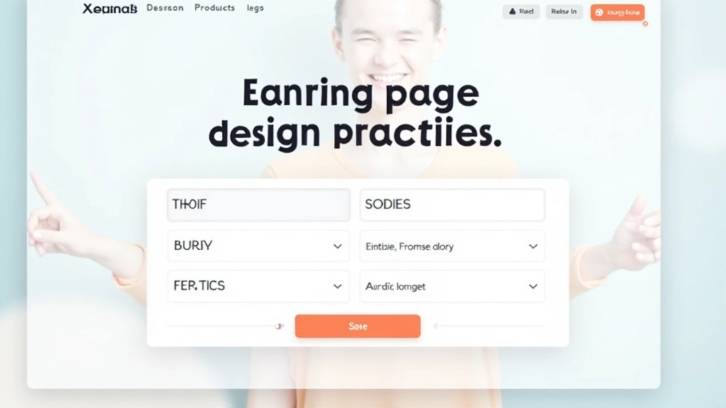
The top layer captures attention. It’s your hero section — the thing people see before scrolling. It needs a clear headline, a supporting visual, and maybe a subheading. Nothing else. Visitors spend about 2-3 seconds here. They’re asking: “Is this for me?”
The middle layer builds credibility. This is where you show proof. Testimonials, case studies, specific results, social proof. You’re answering: “Why should I trust this?” This section does the heavy lifting for conversion. People spend real time here, reading and deciding.
The bottom layer closes the deal. Clear call-to-action, minimal friction, and a path to the next step. You’ve already convinced them — now just make it easy to say yes.
Hero Section: Your First Impression Window
Your hero section has one job: stop the scroll and answer one question clearly. Most headlines fail because they’re too clever or too vague. “Unlock Your Potential” doesn’t tell me anything. “Build Landing Pages 3x Faster” does.
The best hero sections follow a simple formula. Headline tells me what you do (not what you believe). Subheading explains who it’s for and what I’ll get. Image shows the actual product or result, not abstract concepts. One clear button below everything else.
Spacing matters here too. Don’t cram everything together. Let the headline breathe. Give the subheading room to be read. The image should be prominent — often 40-60% of the hero’s visual weight. On mobile, these stack naturally without any design gymnastics.
Visual Hierarchy: Where Eyes Go First
People don’t read landing pages. They scan them. Size, color, and position determine where attention lands first. Your headline should be largest. Your subheading, smaller. Supporting text, smaller still. This isn’t decoration — it’s direction.
Color works the same way. If your button is the same color as everything else, it blends in. Make it contrast. Bright. Impossible to miss. We’ve seen conversion rates jump 15-20% just by making the CTA button more visually distinct from the page background.
Whitespace is a hierarchy tool too. Don’t underestimate it. Cramped pages feel overwhelming. Spacious pages feel premium. You’re not wasting space — you’re creating clarity. Sections need breathing room between them. 40-80 pixels of gap usually works well.
Three Layouts That Actually Work
The Two-Column Split
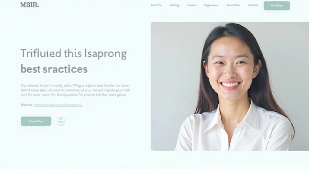
Text on the left, image on the right. It’s classic for a reason. Feels balanced, reads naturally, and converts reliably. Works especially well when your product is visual or when you need to show specific features.
Typical conversion rates: 3-5% depending on traffic quality. Mobile: stacks to single column naturally.
The Full-Width Hero + Stacked Content
Dramatic hero section (often full viewport height) followed by narrow content sections below. Creates strong visual impact. Feels modern and premium. Best for brands that need to establish presence before diving into details.
Typical conversion rates: 2-4%. Works better for brand awareness than immediate action, but still converts.
The Single-Column Flow
Everything in one column, max-width around 600-700px. Forces focus. No distraction. Reads like a good article. Perfect for detailed explanations, education-focused pages, or when you want visitors to engage deeply.
Typical conversion rates: 4-7% for qualified traffic. Highest engagement time on page. Mobile-friendly by design.
CTA Placement: Where Buttons Actually Drive Clicks
Don’t bury your button. Don’t repeat it endlessly either. The sweet spot? First button above the fold (within the first screen people see), then one more around mid-page, and a final one at the bottom. Three placement points. Not ten.
Button text matters too. “Submit” is forgettable. “Get Started” is generic. “See Your Results in 30 Days” or “Join 500+ Users” gives people a reason to click. Action-oriented language works. Vague language doesn’t.
Size and color come next. Your button should be noticeably larger than regular text. Contrast is critical — if your page is light, use a bold dark button. If your page is dark, use bright color. We’ve seen 25-40% improvements just by increasing button contrast against the background.
Five Core Principles That Drive Conversions
Clarity Over Creativity
Your visitor should understand your offer within 5 seconds. Not impressed by your offer — just understand it. Clever headlines fail. Clear headlines win.
Progressive Disclosure
Don’t explain everything at once. Hero section: the headline and main benefit. Next section: who you serve. Third section: proof. Final section: how to get started. Each section reveals more, building toward the ask.
Visual Consistency
Your layout should feel intentional, not random. Consistent spacing, consistent typography, consistent color use. Visitors sense professionalism or chaos — and they decide in seconds which one you are.
Friction Reduction
Every element should serve conversion. Slow animations? Remove them. Complex navigation? Simplify it. Too many form fields? Cut half. Every friction point you remove increases conversion rates.
Mobile-First Reality
60-75% of your traffic comes from mobile devices. Don’t build desktop-first and hope it works on phones. Design for mobile constraints first, then enhance for desktop. It’s harder but it works.
Testing Your Layout: What Actually Matters
You can’t optimize what you don’t measure. Track three metrics: scroll depth (how far do people scroll?), click-through rate (how many click your buttons?), and conversion rate (how many complete the desired action?).
Start with your worst-performing page. Change one layout element — maybe move the CTA button, or adjust spacing between sections, or simplify your headline. Run it for 100-200 visits. Compare the results to your original. If it improves, keep it. If not, revert.
This isn’t expensive. You don’t need fancy tools. Google Analytics gives you scroll depth. Your forms tell you conversion rate. A/B testing tools are affordable. The real cost is time, but even small improvements compound. A 1% conversion lift might not sound like much — until you multiply it by your monthly traffic.

Building Layout Structure That Converts
Structure isn’t boring. It’s powerful. The pages that convert aren’t the ones with the fanciest design — they’re the ones with the clearest path forward. Three-layer foundation. Clear visual hierarchy. Strategic button placement. Mobile-first approach.
You don’t need permission to start experimenting. Build something simple first. Measure how it performs. Change one element at a time. Keep what works, discard what doesn’t. Over weeks and months, your layout will improve, and your conversions will follow.
The difference between a landing page that converts and one that doesn’t? Usually, it’s not the offer. It’s not the copy. It’s the structure. Make your structure count.
Key Takeaways
- Three-layer structure: Hook Build Credibility Drive Action
- Hero section captures attention in first 2-3 seconds
- Visual hierarchy guides attention through size, color, and position
- Three CTA placements: above fold, mid-page, bottom
- Mobile-first design for 60-75% of your actual traffic
- Test one element at a time and measure results
Disclaimer
This article provides educational information about landing page layout best practices and design principles. While these patterns are based on common design practices, actual conversion rates and results vary significantly based on your specific industry, audience, traffic quality, offer, and implementation. Results mentioned (like “3-5% conversion rates”) are general examples and shouldn’t be treated as guarantees. Every landing page is unique. We recommend testing these principles with your own audience and measuring your specific results. Consult with a qualified designer or conversion specialist for personalized guidance tailored to your business needs.