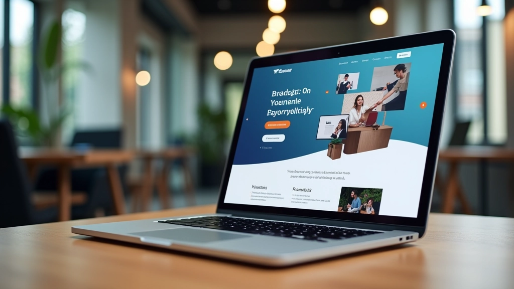
Hero Section Composition: What Actually Captures Attention
Your hero section gets three seconds. Maybe less. We’re breaking down the elements that actually work — headline placement, imagery strategy, and why negative space matters more than you think.

Why Your Hero Section Matters
You’ve got one shot. That’s not exaggeration — most visitors form opinions about your landing page in the first 2-3 seconds. Your hero section isn’t just decoration. It’s the foundation of whether someone stays or leaves.
We’ve tested dozens of hero variations across different industries. The patterns are clear: it’s not about flashy animations or the biggest image. It’s about composition. How elements relate to each other. Where your eye travels. How much breathing room you give the viewer.
This guide covers the actual mechanics of effective hero design — the things that convert, not just the things that look nice.
Headline Placement Changes Everything
Your headline isn’t just words. It’s the first focal point. And where you place it matters enormously.
Left-aligned headlines create movement — your eye enters from the left and travels right. Center-aligned headlines feel more formal, more established. Right-aligned? Rarely works unless you’re being intentionally unconventional.
But here’s what we’ve learned from testing: headline position works best when it’s paired with image hierarchy. If your image has a strong focal point on the right, your headline should anchor the left. If your image is balanced, centered text can work. The two elements need to dance together, not compete.
Size matters too, but not how you’d think. A 48px headline isn’t automatically better than 36px. What matters is contrast with the supporting text. Your subheadline should feel clearly secondary — visually smaller, lighter in weight, perhaps a different color. That relationship is what creates hierarchy.
The Imagery Strategy That Works
Here’s what doesn’t work: random stock photos. Beautiful images of people in impossible situations doing unrelated activities. You’ve seen them. Everyone has. They’re instantly forgettable.
What does work is contextual imagery. Show your actual product. Show real scenarios. Show what the user is actually getting. A SaaS platform? Show the interface. A coaching service? Show the activity happening. Real results from real people matter more than aspirational lifestyle imagery.
Image sizing is strategic too. We tend to see two approaches that convert: either go large (image takes 50-60% of hero space, letting the headline breathe on the side) or go minimal (image is maybe 30-40%, keeping focus on the message). The awkward middle — where image is 45% — often feels cramped.
Color and contrast within your image matter. If your image is dark and moody, light text works perfectly. If it’s bright and clean, dark text becomes the contrast. Don’t fight your image — use it.

Negative Space Is Your Secret Weapon
This is where amateur designs fail. They cram everything. Every pixel is fighting for attention. The result? Nothing gets attention.
Professional heroes breathe. There’s room around elements. Your headline isn’t touching the image. Your image isn’t edge-to-edge. Your call-to-action button sits in its own space, not squeezed between two blocks of text.
Start with at least 60px of padding around your main content. On mobile, you can compress to 20px. On desktop, go generous — 80-120px between your headline and image makes a massive difference. That breathing room signals quality. It signals control.
The rule we follow: if it feels spacious to you, it’s probably right. If you’re worried you’re wasting space, you’re definitely on the right track.
The Three-Element Framework
Every strong hero breaks down to three elements: anchor, support, and action.
Anchor
Your headline. This is the gravitational center. Everything else orbits around it. Make it clear, make it specific. “Build Landing Pages That Convert” beats “Welcome to Our Platform” every time. Your headline should answer the question: what am I looking at?
Support
Your supporting text and imagery. The subheadline, the descriptive paragraph, the image itself. These elements provide context without competing with your headline. They should feel secondary, visually and informationally. They’re explaining, not promoting.
Action
Your button or link. Usually comes last in visual hierarchy. It should be easy to find but not scream for attention. One button typically outperforms multiple options. Make it obvious what happens when clicked — “See Pricing” beats “Learn More” for clarity.
These three elements create a complete story. The anchor tells you what this is. The support explains why you care. The action is the natural next step.
Practical Techniques to Steal
Here are the specific moves we see working consistently:
Contrast Pairing
If your image is dark and moody, use light text. If your image is bright and airy, go dark with text. Don’t pair light image with light text — they’ll blur together. This simple choice impacts readability enormously.
Focal Point Alignment
Where’s the main subject in your image? If it’s centered, center your text. If it’s on the right, left-align your text. Let the image breathe into the space where text isn’t. It creates visual balance automatically.
Hierarchy Through Scale
Headline is large. Subheadline is medium. Body text is small. Button text is medium but different color. This cascade makes scanning effortless. People should understand your message by reading just the headline.
Movement Guides
Where does the eye enter? Usually top-left. Where does it exit? Toward your button. Design your hero to guide that path. Use alignment, color, and spacing to direct attention downward and toward action.
Mobile-First Stacking
On mobile, everything stacks vertically. Image on top, then text, then button. Make sure the image still works when it’s the full width. A hero that looks great on desktop but feels cramped on mobile doesn’t convert.
Color Consistency
Your button should stand out but feel connected to your brand. If your brand is blue, your button should be blue. Don’t randomly introduce new colors. Consistency builds trust faster than novelty.
The Takeaway
Your hero section isn’t about being clever. It’s about being clear. It’s about composition — how elements relate to each other, how space is distributed, how the eye moves through the design.
Start with the three-element framework: anchor, support, action. Pair it with strategic imagery and breathing room. Test how it looks on mobile, tablet, and desktop. Notice what draws attention and what gets lost.
The best hero sections feel effortless. They’re not. They’re the result of careful decisions about hierarchy, contrast, and spacing. But that care creates an experience that feels natural and persuasive.
Ready to Improve Your Hero?
Take these principles and audit your current hero section. How’s the spacing? Is the headline clear? Does the image support or distract? Small changes compound into better conversion.
Explore More Design Topics
About This Content
This article presents design principles and best practices based on industry standards and testing across multiple projects. Results vary depending on your specific audience, product, and context. What works for one industry might not work for another. We recommend testing these principles with your own audience and adjusting based on real data from your landing pages. Design is both art and science — these are guidelines, not guaranteed formulas.