
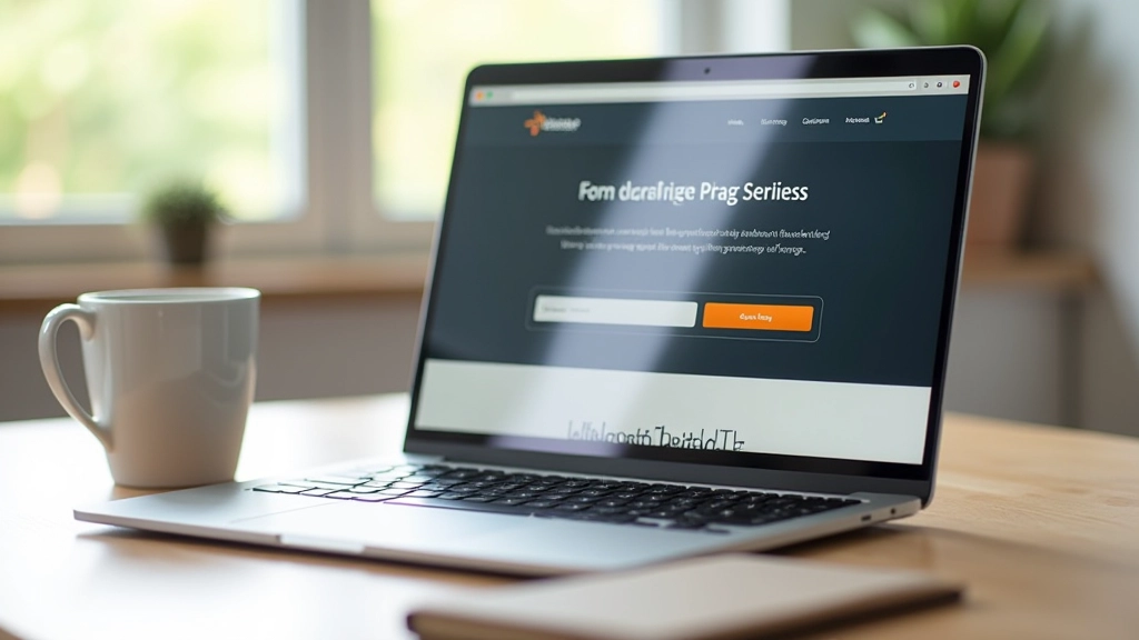
Hero Section Composition: What Actually Captures Attention
Explore the core elements that make hero sections work. Headline placement, imagery strategy, and why negative space matters more than you think.
Read MoreMaster hero sections, strategic CTA placement, and conversion-focused layouts that actually work. Learn what drives results.
Discover proven strategies for building landing pages that convert. We’ve covered the techniques that actually move the needle.
Explore the core elements that make hero sections work. Headline placement, imagery strategy, and why negative space matters more than you think.
Read More
Where should your buttons go? We’ve tested above the fold, sticky positioning, and multiple placements. The data tells a clear story.
Read More
Your page tells a story from top to bottom. Learn how to sequence information, use imagery strategically, and keep visitors scrolling with purpose.
Read More
Structure matters. Discover the proven layout patterns that reduce friction, guide attention, and make visitors want to take action. No guessing required.
Read MoreThese fundamentals show up in every high-converting landing page. Master them and you’ll see immediate improvements.
Don’t dilute your message. One clear goal per page keeps users from getting confused about what you want them to do.
Visitors decide in seconds whether they’re in the right place. Your headline and subheading need to answer: What’s this about? Why should I care?
Size, color, and position guide the eye. Make important elements stand out so users know where to look first, second, and third.
Testimonials, logos, guarantees—these reduce friction. Show visitors they’re not taking a risk by including proof that others have benefited.
Landing page design doesn’t exist in a vacuum. Here’s what we’ve learned about what resonates with audiences across Malaysia.
Malaysian audiences respond to authenticity. Stock photos feel generic—real stories with real people convert better. They also appreciate directness. Don’t make visitors hunt for information or guess what happens next. Be clear about benefits, use straightforward language, and respect their time.
Mobile matters more than ever. More than 80% of traffic comes from phones and tablets in Malaysia. If your landing page isn’t mobile-first, you’re losing conversions before visitors even see your message. Speed matters too—slow pages kill engagement instantly. And finally, cultural relevance goes a long way. References that land with your audience, colors and imagery that feel local, messaging that speaks to actual problems people face here—these details separate winning pages from mediocre ones.